Frequently asked questions
- Can you make a map with such-and-such a color scheme? We're
really busy so we're probably not going to be making many more maps.
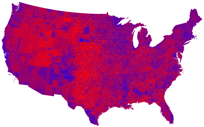
However, you can easily make maps with other color schemes yourself. It is
a trivial matter to take the purple
maps, separate out the blue and red channels, and then
remap them any way you like. This is just a couple of clicks in Photoshop.
(In fact, we used the excellent free Photoshop clone Gimp for our image
manipulation, which does the job very well. You can download it from here.)
- Can you make a map showing such-and-such data? Many people have
asked for maps showing votes in previous elections, number of people who
voted, number of registered voters, differences between Bush and Kerry
votes, and all sorts of other things. Once again, we are probably too busy
to do this, but we certainly encourage others to make such maps. Our
software for creating the cartograms is freely available for download here.
- Where are Alaska and Hawaii? Not on the maps. We know. Sorry.
There are some technical problems with non-contiguous cartograms and
particularly with the highly non-uniform population density in Alaska that
make it difficult to produce nice maps. For the special case where the
density is uniformly distributed over the state you can make cartograms
that look reasonable, and we have done that here. For the more general case of the
county-by-county cartogram we need to do more work.
- Where can I get high-resolution copies of your figures? You can
get them here. Enjoy!
- Can I use your figures in my magazine, newspaper, mailing list, web
page, artwork, wall hanging, interpretive dance, etc? Absolutely. Our
maps and the accompanying text are released under a Creative Commons
License that allows for their free distribution and use in derivative
works. We would appreciate hearing from you if you wish to make use of our
work, but it is not required under the terms of the license.
- Have these maps been getting press coverage? Indeed they have.
They have appeared in the Washington Post, on CNN Headline News, in The
Guardian, and on Salon.com among other places. You are welcome to put them
in your publication as well; see above for the licensing details.
- What other work has been done on mapping the election results?
Lots. Far too much to mention here. But some that we find interesting
include this,
this, this,
and this.
There is a collection of links to various maps, not all of them serious, here.
Mark Newman, Department
of Physics and Center for the Study of Complex Systems, University of
Michigan
Updated: November 25, 2004