
Email: Thanks to everyone who wrote to us about the maps. We've had over a million hits on the web page and received so much email that we may not be able to reply to everyone, but we much appreciate all your comments and suggestions. Most of the things people have been asking about are answered in this list of frequently asked questions.
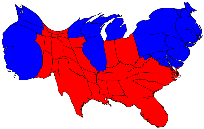
On election night and in the months since then, we have seen many maps that look like this (click on any of the maps for a larger picture):
The (contiguous 48) states of the country are colored red or blue to indicate whether a majority of their voters voted for the Republican candidate (George W. Bush) or the Democratic candidate (John F. Kerry) respectively. The map gives the superficial impression that the "red states" dominate the country, since they cover far more area than the blue ones. However, as pointed out by many others, this is misleading because it fails to take into account the fact that most of the red states have small populations, whereas most of the blue states have large ones. The blue may be small in area, but they are large in terms of numbers of people, which is what matters in an election.
We can correct for this by making use of a cartogram, a map in which the sizes of states have been rescaled according to their population. That is, states are drawn with a size proportional not to their sheer topographic acreage -- which has little to do with politics -- but to the number of their inhabitants, states with more people appearing larger than states with fewer, regardless of their actual area on the ground. Thus, on such a map, the state of Rhode Island, with its 1.1 million inhabitants, would appear about twice the size of Wyoming, which has half a million, even though Wyoming has 60 times the acreage of Rhode Island.
Here are the 2004 presidential election results on a population cartogram of this type:
(A version including Alaska and Hawaii is here.)
The cartogram was made using the diffusion method of Gastner and Newman. Population data were taken from the 2000 US Census.
The cartogram reveals what we know already from the news: that the country was actually very evenly divided by the vote, rather than being dominated by one side or the other.
The presidential election is not decided on the basis of the number of people who vote each way, however, but on the basis of the electoral college. Each state contributes a certain number of electors to the electoral college, who vote according to the majority in their state. The candidate receiving a majority of the votes in the electoral college wins the election. The electoral votes are apportioned roughly according to states' populations, as measured by the census, but with a small but deliberate bias in favor of smaller states.
We can represent the effects of the electoral college by scaling the sizes of states to be proportional to their number of electoral votes, which gives a map that looks like this:

This cartogram looks very similar to the one above it, but it is not identical. Wyoming, for instance, has approximately doubled in size, precisely because of the bias in favor of small states.
The areas of red and blue on the cartogram are now proportional to the actual numbers of electoral votes won by each candidate. Thus this map shows at a glance both which states went to which candidate and which candidate won more votes -- something that you cannot tell easily from the normal election-night red and blue map.
But we can go further. We can do the same thing also with the county-level election results and the images are even more striking. Here is a map of US counties, again colored red and blue to indicate Republican and Democratic majorities respectively:

Similar maps have appeared in the press, for example in USA Today, and have been cited as evidence that the Republican party has wide support. Again, however, a cartogram gives a more accurate picture. Here is what the cartogram looks like for the county-level election returns:

Again, the blue areas are much magnified, and areas of blue and red are now nearly equal. However, there is in fact still more red than blue on this map, even after allowing for population sizes. Of course, we know that nationwide the percentages of voters voting for either candidate were almost identical, so what is going on here?
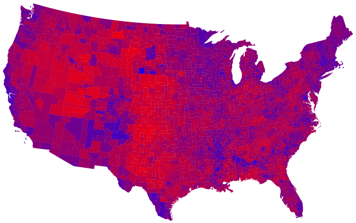
The answer seems to be that the amount of red on the map is skewed because there are a lot of counties in which only a slim majority voted Republican. One possible way to allow for this, suggested by Robert Vanderbei at Princeton University, is to use not just two colors on the map, red and blue, but instead to use red, blue, and shades of purple to indicate percentages of voters. Here is what the normal map looks like if you do this:
And here's what the cartogram looks like:

In this map, it appears that only a rather small area is taken up by true red counties, the rest being mostly shades of purple with patches of blue in the urban areas.
A slight variation on the same idea is to use a nonlinear color scale like this:


These maps use a color scale that ranges from red for 70% Republican or more, to blue for 70% Democrat or more. This is sort of practical, since there aren't many counties outside that range anyway, but to some extent it also obscures the true balance of red and blue.
Finally, if you found the maps on this page interesting, you might be interested in this page also, which contains a collection of cartograms of the entire world, depicting all sorts of different things. It's nothing to do with the election, but it's worthwhile reading nonetheless.
Frequently asked questions (FAQs): A list of frequently asked questions concerning our maps, along with answers, can be found here.
Correction: The figures for numbers of counties voting Rep/Dem were off because of a bug in one of our programs. We've fixed this and corrected the text above. Thanks to K. Drum and others for pointing this out. (All the actual maps were fine however.)
Update: We've done some slight improvements to the cartograms, based on updated population and electoral data. (You'll have to look pretty hard to see any difference though.)
Update: We changed the color scale on the purple maps to be the same as that used by Robert Vanderbei. The old maps are still available above for those who are interested.
Wallpapers: By popular demand, all of the maps are now available in "wallpaper" sizes for your computer desktop. Click here.
Correction: The colors of a few counties in Texas and in Delaware got swapped around because of differences in the alphabetizing of lists of election returns. This is fixed now on all the maps. Thanks to J. Henderson and S. Hughes for spotting the problems and letting us know.
Update: We've added a cartogram with areas of states proportional to the number of votes they have in the electoral college.
© 2004 M. T. Gastner, C. R. Shalizi, and M. E. J. Newman

High-resolution versions of the figures are available here. Even higher-resolution ones are available on request from the authors.
Our computer software to produce cartograms is freely available here.
The views expressed are personal and are not necessarily shared by the University of Michigan.
Mark Newman, Department of Physics and Center for the Study of Complex Systems, University of Michigan