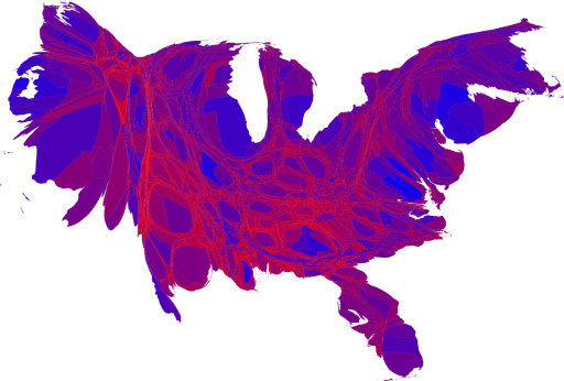
Return of the Cartogram
Four long, long years ago, I helped Michael Gastner and Mark Newman make some cartograms of the last Presidential election, showing areas on the electoral map in proportion to population, not to land-mass. People liked them (though apparently professional cartographers hate them), and I am very happy to relate that Mark has made a new set of cartograms with last night's results:

This map makes me happy, though not nearly as much as the reality.
Posted at November 05, 2008 13:00 | permanent link