Of Variance Explained; or, Chronicles of Deaths Smoothed
Attention conservation notice: 1500 word pedagogical-statistical rant, with sarcasm, mathematical symbols, computer code, and a morally dubious affectation of detachment from the human suffering behind the numbers. Plus the pictures are boring.
Does anyone know when the correlation coefficient is useful, as opposed to when it is used? If so, why not tell us?
— Tukey (1954: 721)
If you have taken any sort of statistics class at all, you have probably been exposed to the idea of the "proportion of variance explained" by a regression, conventionally written \( R^2 \). This has two definitions, which happen to coincide for linear models fit by least squares. The first is to take the correlation between the model's predictions and the actual values (\( R \)) and square it (\( R^2 \)), getting a number which is guaranteed to be between 0 and 1. You get 1 only when the predictions are perfectly correlated with reality, and 0 when there is no linear relationship between them. The other definition is the ratio of the variance of the predictions to the variance of the actual values. It is this latter which leads to the notion that \( R^2 \) is the proportion of variance explained by the model.
The use of the word "explained" here is quite unsupported and often actively misleading. Let me go over some examples to indicate why.
Start by supposing that a linear model is true: \[ Y = a + bX + \epsilon \] where the noise \( \epsilon \) has constant variance \( s \), and is uncorrelated with \( X \). Suppose that we know this is the model to use, and suppose further that, as a reward for our scrupulous peer-review of anonymous manuscripts, the Good Fairy of Statistical Modeling tells us the correct values of the parameters \( a \) and \( b \). Surely, with the right parameters in the right model, our \( R^2 \) must be very high?
Well, no. The answer depends on the variance of \( X \), which it will be convenient to call \( v \). The variance of the predictions is \( b^2 v \), but the variance of \( Y \) is larger, \( b^2 v + s\). The ratio is \[ R^2 = \frac{b^2 v}{b^2v + s} \] (You can check that this is also the squared correlation between the predictions and \( Y \).) As \( v \) shrinks, this tends to \( 0/s = 0 \). As \( v \) grows, this ratio tends to 1. The relationship between \( X \) and \( Y \) doesn't change, the accuracy and precision with which \( Y \) can be predicted from \( X \) does not change, but \( R^2 \) can wander all through its range, just depending on how dispersed \( X \) is.
Now, you say, this is a silly algebraic curiosity. Never mind the Good Fairy of Statistical Modeling handing us the correct parameters, let's talk about something gritty and real, like death in Chicago.
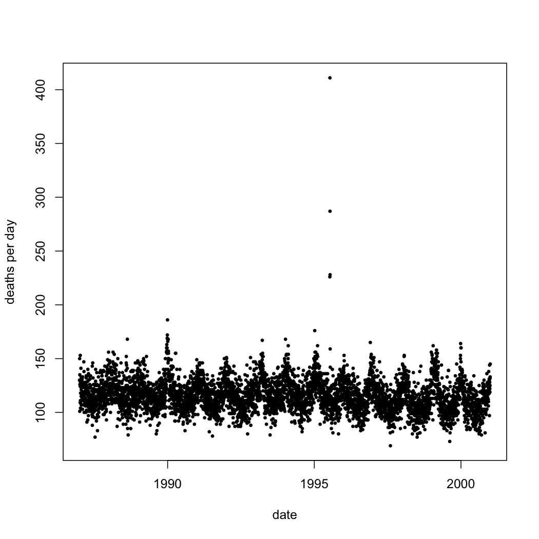 |
| Number of deaths each day in Chicago, 1 January 1987--31 December 2000, from all causes except accidents. (Click this and all later figures for larger PDF versions. See below for link to code.) |
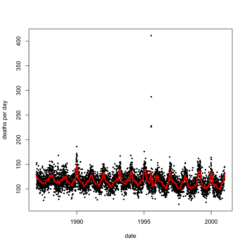
I can relate deaths to time in any number of ways; the next figure shows what I get when I use a smoothing spline (and use cross-validation to pick how much smoothing to do). The statistical model is \[ \mathrm{death} = f_0(\mathrm{date}) + \epsilon \] with \( f_0 \) being a function learned from the data.
|
| As before, but with the addition of a smoothing spline. |
The root-mean-square error of the smoothing spline is just above 12 deaths/day. The \( R^2 \) of the fit is either 0.35 (squared correlation between predicted and actual deaths) or 0.33 (variance of predicted deaths over variance of actual deaths). It seems absurd, however, to say that the date explains how many people died in Chicago on a given day, or even the variation from day to day. The closest I can come up with to an example of someone making such a claim would be an astrologer, and even one of them would work in some patter about the planets and their influences. (Numerologists, maybe? I dunno.)
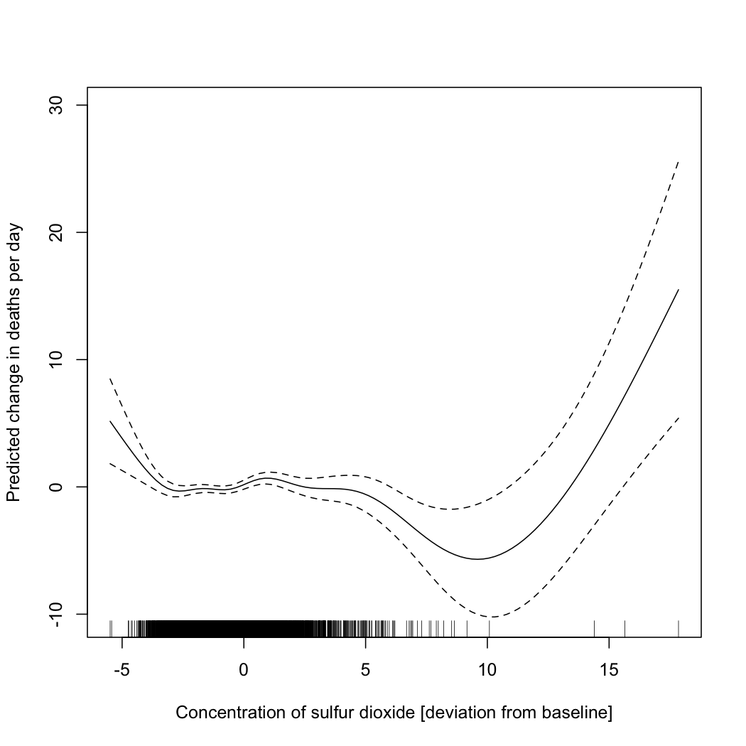
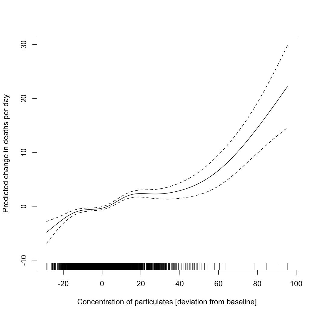
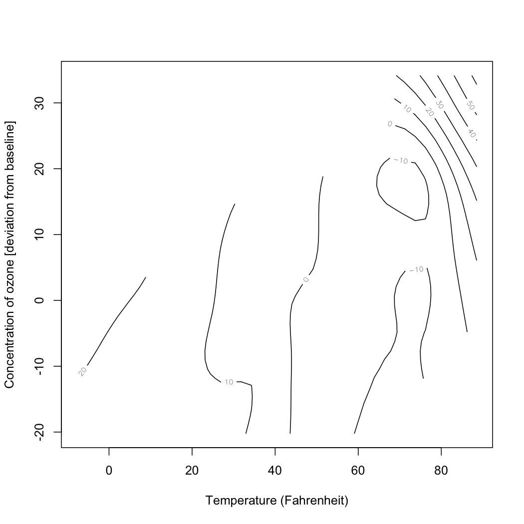
Worse is to follow. The same data set which gives me these values for Chicago includes other variables, such as the concentration of various atmospheric pollutants and temperature. I can fit an additive model, which tries to tease out the separate relationships between each of those variables and deaths in Chicago, without presuming a particular functional form for each relationship. In particular I can try the model \[ \mathrm{death} = f_1(\mathrm{sulfur\ dioxide}) + f_2(\mathrm{particulates}) + f_3(\mathrm{temperature},\mathrm{ozone}) + \epsilon \] where the functions \( f_1 \) \( f_2 \) and \( f_3 \) are all learned from data. (Exercise: why do I do a joint smoothing against temperature and ozone?) When I do that, I get functions which look like the following.
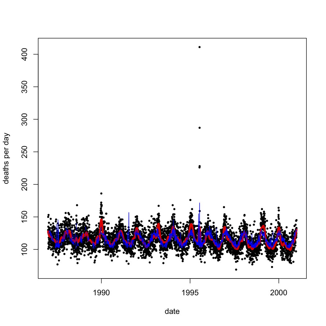
The \( R^2 \) of this model is 0.27. Is this "variance explained"? Well, it's at least not incomprehensible to talk about changes in temperature or pollution explaining changes in mortality. In fact, overlaying this model's predictions on the simple spline's, we see that most of what the spline predicted from the date is predictable from pollution and temperature:
|
| Black dots: actual death counts. Red curve: spline smoothing on the date alone. Blue lines: predictions from the temperature-and-pollution model. |
We could, in fact, try to include the date in this larger model: \[ \mathrm{deaths} = f_0(\mathrm{date}) + f_1(\mathrm{sulfur\ dioxide}) + f_2(\mathrm{particulates}) + F_3(\mathrm{temperature}, \mathrm{ozone}) + noise \] Of course, we have to re-estimate all the functions, but as it turns out they don't change very much. (I'd show you the plot of the fitted values over time as well, but visually it's almost indistinguishable from the last one.)
|
|
|
|
Despite the lack of visual drama, putting a smooth function of time back into the model increases \( R^2 \), from 0.27 to 0.30. Formally, the date enters into the model in exactly the same way as particulate pollution. But, again, only a fortune teller — an unusually numerate fortunate teller, perhaps a subscriber to the Journal of Evidence-Based Haruspicy — would say that the date explains, or helps explain, 3% of the variance.
I hope that by this point you will at least hesitate to think or talk about \( R^2 \) as "the proportion of variance explained". (I will not insist on your never talking that way, because you might need to speak to the deluded in terms they understand.) How then should you think about it? I would suggest: the proportion of variance retained, or just kept, by the predictions. Linear regression is a smoothing method. (It just smoothes everything on to a line, or more generally a hyperplane.) It's hard for any smoother to give fitted values which have more variance than the variable it is smoothing. \( R^2 \) is merely the fraction of the target's variance which is not smoothed away.
This of course raises the question of why you'd care about this number at all. If prediction is your goal, then it would seem much more natural to look at mean squared error. (Or really root mean squared error, so it's in the same units as the variable predicted.) Or mean absolute error. Or median absolute error. Or a genuine loss function. If on the other hand you want to get some function right, then your question is really about mis-specification, and/or confidence sets of functions, and not about whether your smoother is following every last wiggle of the data at all. If you want an explanation, the fact that there is a peak in deaths every year of about the same height, but the predictions fall short of it, suggests that this model is missing something. The fact that the data shows something awful happened in 1995 and the model has nothing adequate to say about it suggests that whatever's missing is very important.
Code for reproducing the figures and analyses in R. (I make this public, despite the similarity of this exercise to the last problem-set in advanced data analysis, because (i) it's not exactly the same, (ii) the homework is due in ten hours, (iii) none of my students would dream of copying this and turning it in as their own, and (iv) I borrowed the example from Simon Wood's Generalized Additive Models.)
Manual trackback: Bob O'Hara; Siris
Posted at February 13, 2012 23:54 | permanent link
